Modernizing and optimizing a key communication method within the email security product.
The Barracuda Email Security Service is a SaaS product that protects an organization’s e-mail from malicious threats. The service can be configured in a limitless number of ways to enforce the security posture of the customer’s institution.
These notifications were heavily utilized in the product and are crucial to its use depending upon the way IT administrators have chosen to utilize the product. The quarantine notifications in the product had not been reworked since their introduction and over the years a number of concerns and requests had come in through support.
What our users were saying.
“I can’t always see what the e-mail is about because the subject line is cut off”
“It is hard to see the e-mail on mobile because its too small and I have to pinch and zoom to read it.”
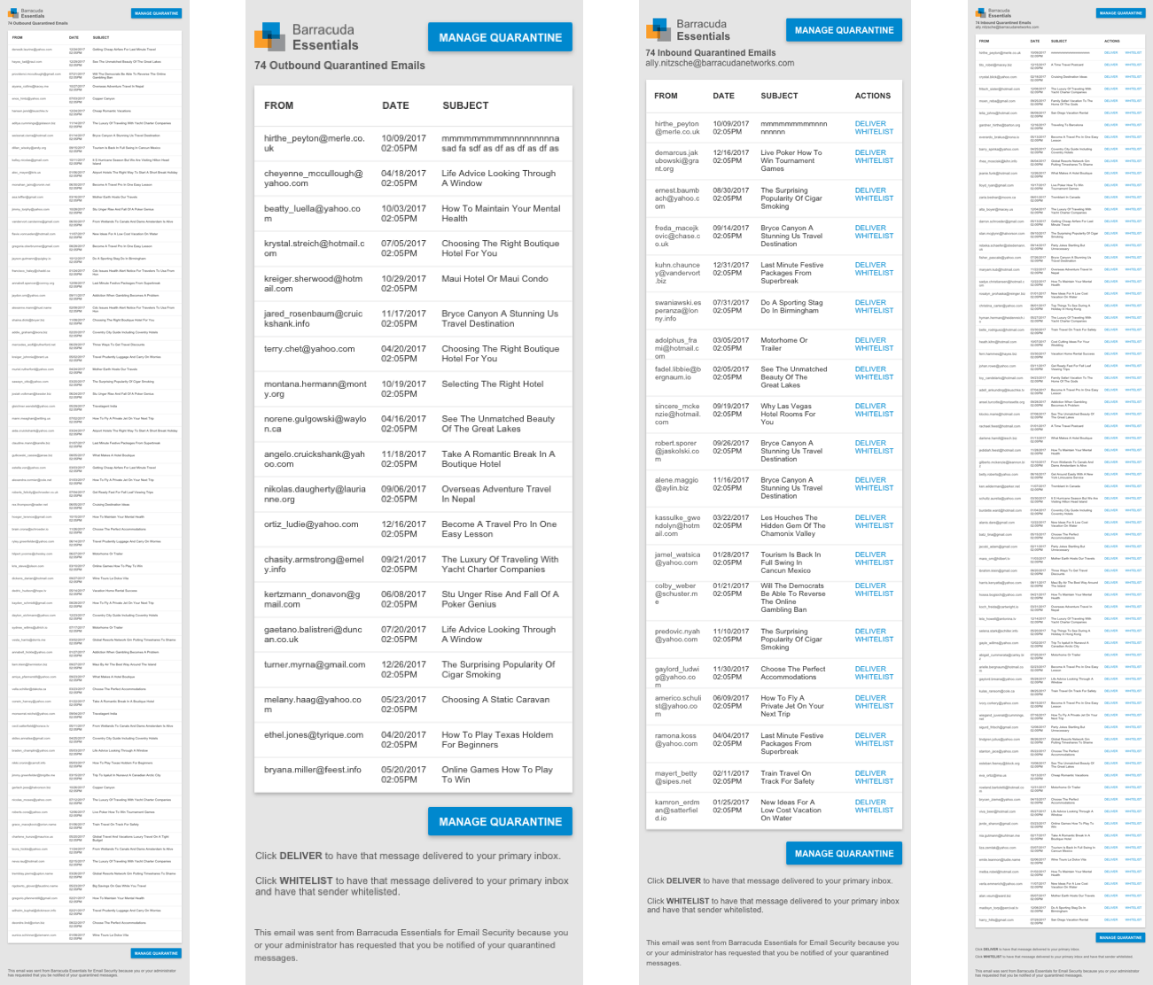
In many of the policy settings the IT admin can set the emails to quarantine for inbound and outbound emails which then forward the e-mail to a cloud quarantine inbox when certain criteria is met.
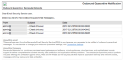
Outbound quarantine notifications are forwarded to the admin or the admin’s IT staff. These notifications occur when an email gets sent out from a user that meets certain criteria (ex. there is a social security number in the email) and the admin wants to make sure that they review all of these emails. Oftentimes the reason the admin wants to review are for compliance reasons.
Inbound quarantine notifications are generally sent to the organizations end users. If the admin chooses to allow their email users to manage their quarantine they can set up these notifications. These notifications let their users know that they have emails in Email Security Service that are in quarantine and may need to have action taken on them.
These notifications were heavily utilized in the product and are crucial to its use depending upon the way organizations have chosen to utilize the product. Often these notifications are very time sensitive as they are notifying users that some emails have not reached their final destination. The quarantine notifications in the product had not been reworked since their introduction many years ago and a number of valid concerns and requests had come in through support.
The Design Process
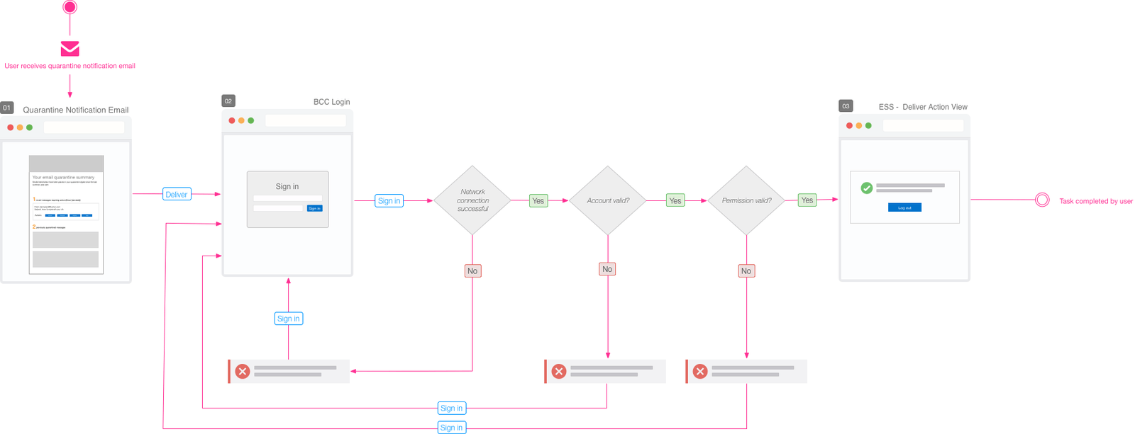
To better get familiar with the functionality of these notifications I created diagrams to understand the user’s current workflow.
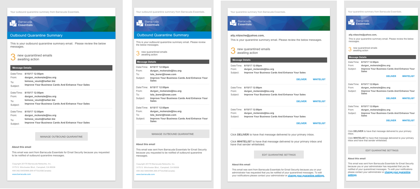
I then sketched some possible solutions.
After I felt good about the ideas I had brainstormed I set out to create a series of mockups. My background in e-mail marketing design and development was very helpful in this project, because I had a better idea of what could be done from a technical standpoint.
Testing, Validation and Iteration.
In lieu of user testing the new designs the product team decided that we would release the first approved design to a certain percentage of our users and gauge the reception before a full roll out.
After the first round of design went live we received an inundation of negative feedback. The group of users who had gotten the new designs were very unhappy. We had fixed the two problems we had set out to solve but created new problems in the process.
After receiving this feedback we reached out to our users and discovered that they really liked the visual design of the notifications, there were some major usability issues:
- For notifications that had large amounts of messages referenced the e-mails became unusable
- Users tended to “scan” the notification messages quickly and even though the new format was very friendly for mobile devices it slowed them down to the point where it was not functional
- There were also problems with the technical implementation as the e-mails were not rendering properly in older versions of Microsoft Outlook
A strategic roll out proved invaluable to understanding how these notifications were used.
Learning from mistakes and creating an even better solution.
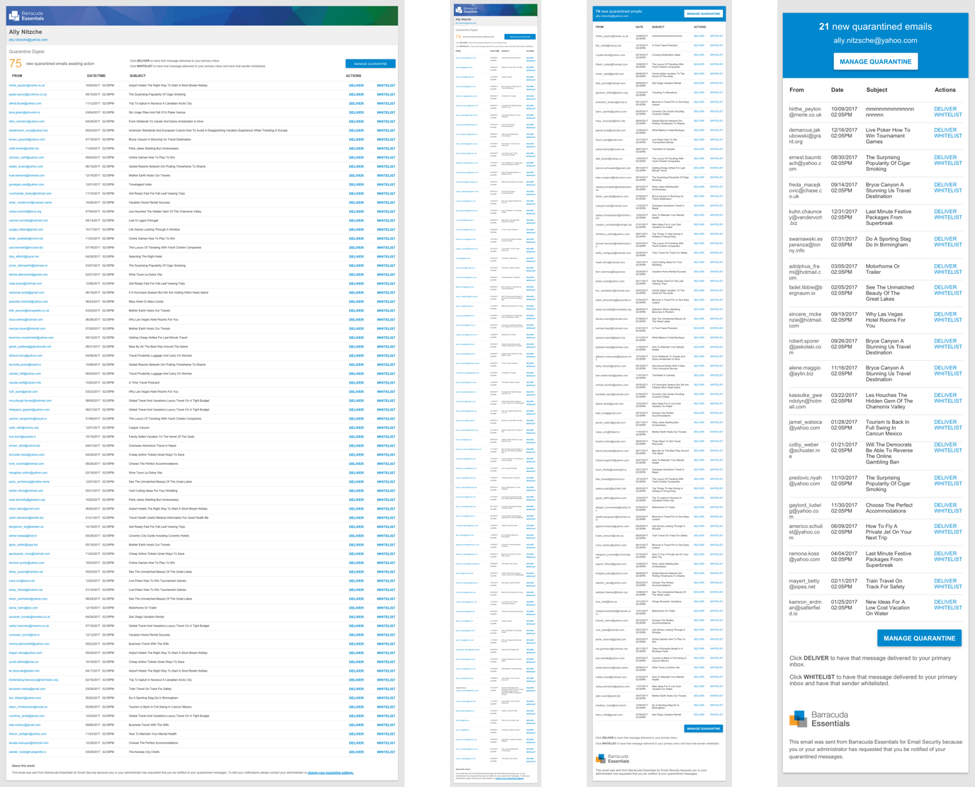
After this round of user feedback I set out to rework the design and take their concerns into consideration. I realized I over optimized for mobile devices and decided that I would scale that back to find a happy medium between desktop and mobile.
Some changes that were made:
- Make the information more dense so more could be fit on the visible screen
- Reduce button size. Users said they were more concerned with scanning the email than having to pinch and zoom to take an action.
- Rework some of the visual design so it would work well on more e-mail clients
Due to the limitations of HTML e-mail coding we went through many rounds of prototypes before we found a solution that we could implement and was favorable with our users.
Through iteration and user testing we were able to release a solution that both solves problems and modernized these notifications.
We released the new version out to the same individuals from the first round and got a very favorable reception. Concerns from the new design were minor and mostly revolved around small technical issues. We then released the design to all of our users and experienced a similarly good result.