Protecting an organization and its users from inappropriate and malicious internet traffic while promoting understanding.
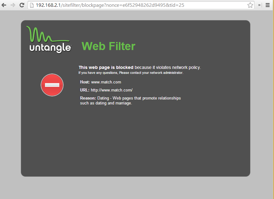
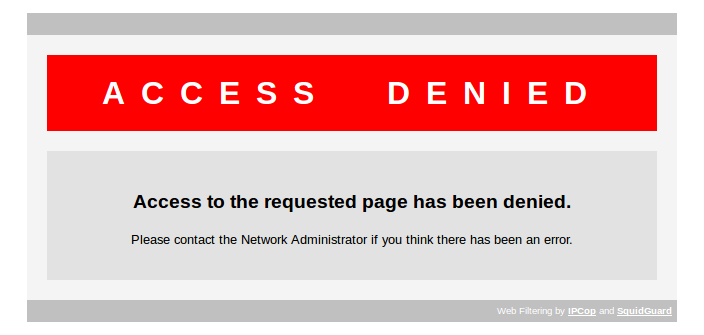
Many of the products in Barracuda’s portfolio allowed IT administrators the ability to block web traffic that was deemed to be malicious or to have inappropriate content for the users of the organization. There were multiple products in the portfolio that blocked content that originated from a URL.
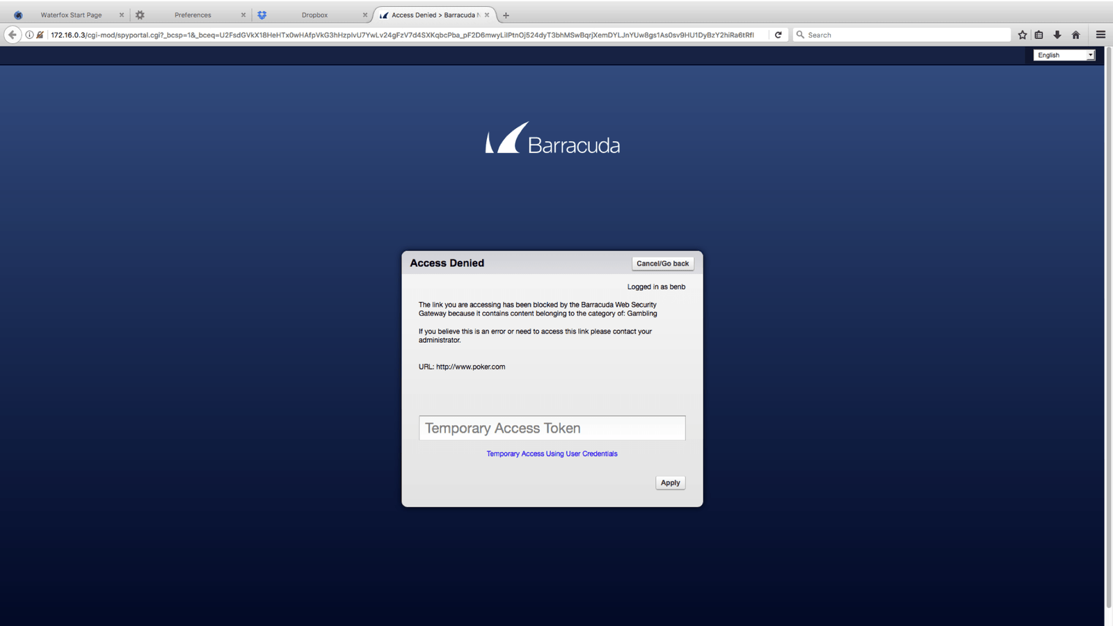
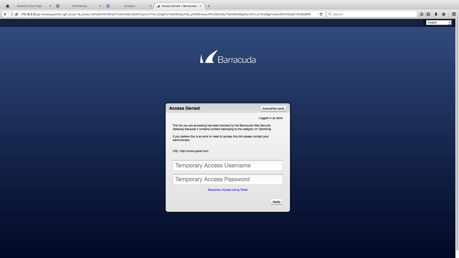
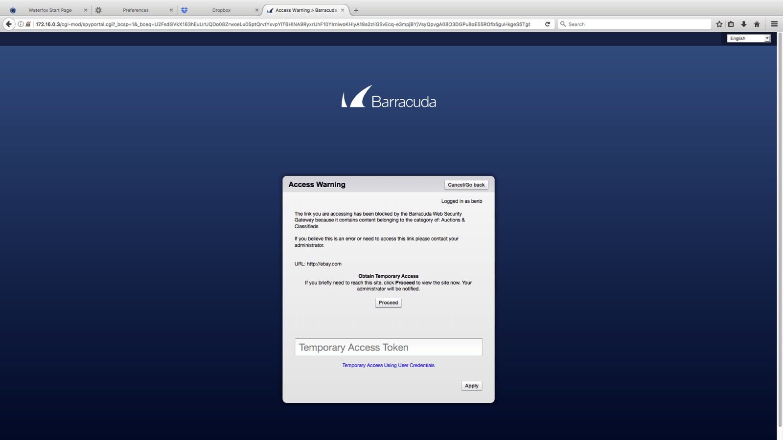
URLs could be blocked for the following reasons:
- Inappropriate content (as deemed by the organization’s internet usage policy)
- The URL has been recognized as a typosquatted domain (Example: Google.com VS Gooogle.com)
- The url points to a malicious file
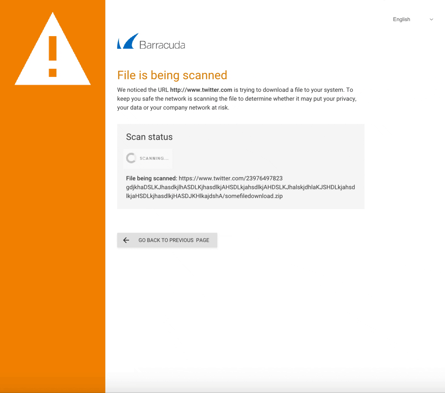
When this web traffic is blocked the product displays a notification in the form of a web page that lets the user know why they were not allowed to access this content.
Understanding the Problem.
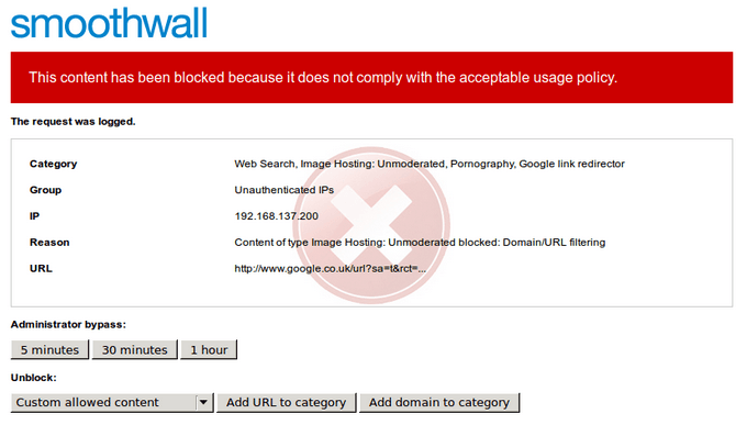
The product team for the Barracuda Web Filter product team approached me with a number of concerns regarding their existing block pages.
Their concerns:
- Outdated design
- Inability to adapt to mobile devices
- Poor UX
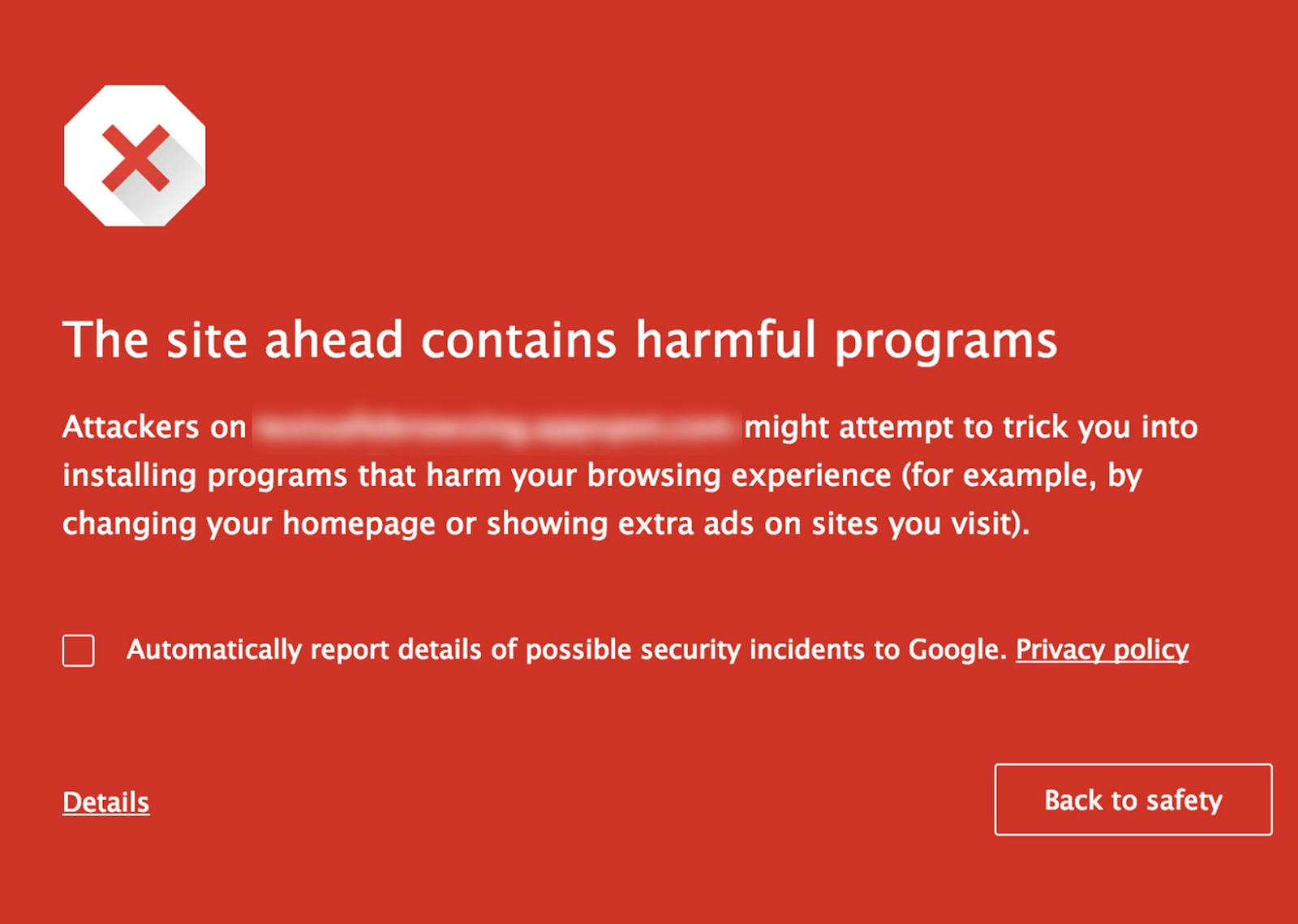
They were also going to introduce a new feature that allowed for scanning of links to files. This new feature was powered by a microservice that another engineering team had built and was managing. The microservice’s existing block pages had been redesigned in the past couple of years, but neither the product team nor the users were happy with them.
So at the beginning of the project there were essentially two products with vastly different sets of block pages. If the Web Filter team did not make efforts to redesign their pages then there would be an inconsistent experience within their own product.
Understanding Our Users.
There are two main types of users that are exposed to the UI:
- IT Administrators – have a highly specialized technical background and understand security concepts
- End users – consume traffic on a network and could have any type of technical background
The latter type of user are the ones that would be most affected by this change. In the last ten years more users are surfing the web and checking their email on mobile devices.
What current paradigms and patterns were users were accustomed to?
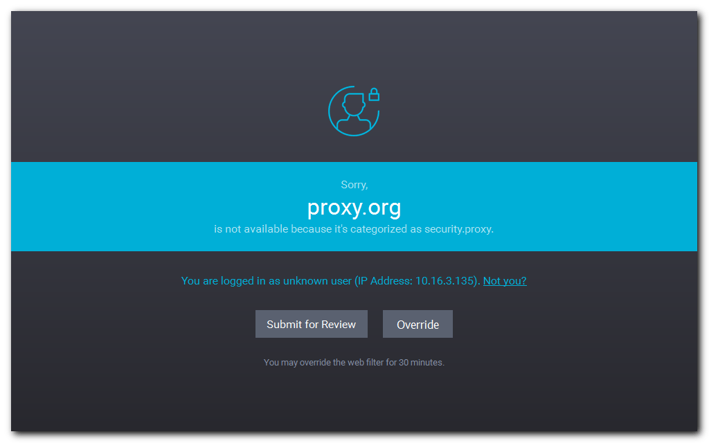
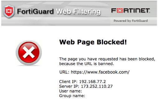
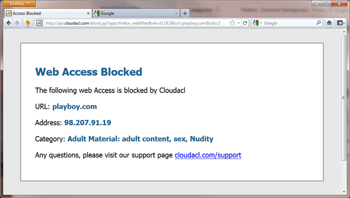
I conducted competitive research on these types of pages it was very apparent that the market was divided. There were many products that were in the same boat with their block pages as Barracuda and there were others that took the time to modernize the UI of these highly visible pages.


What actions are users take when they are exposed to these pages? How are they consuming or understanding the content? What are they feeling?
Usability testing revealed that these types of pages were, as expected, very disruptful and frustrating to our end users.
It is intentional that this part of the UI restrict a user’s ability to complete an objective in order to protect them against unknowingly introducing security vulnerabilities or violating a company’s internet policy.
The challenge was how to accomplish an organization’s goal of restricting traffic while reducing current user annoyance. To increase tolerance it was learned that communicating the reason for the interruption had to be done very quickly. Most users would not take the time to fully read the message displayed and just default to a frustrated state. If the reason was communicated very simply and clearly it seemed to lessen frustration, especially in the cases of malicious content.
“I just wanted to go to this page and now its not letting me.”
“I am frustrated because I can’t go where I want, but after reading I realize that its for my protection and this website might have a virus”
The Design Process.
After user testing I took a look at the Web Filter pages and the ATP microservice block pages and began to create some workflow diagrams based on the current implementation. After I validated those workflows with the product managers and engineers I completed a series of sketches to better get an idea of how I could structure these pages to fit in with the current capabilities, be consistent across multiple products and be responsive.
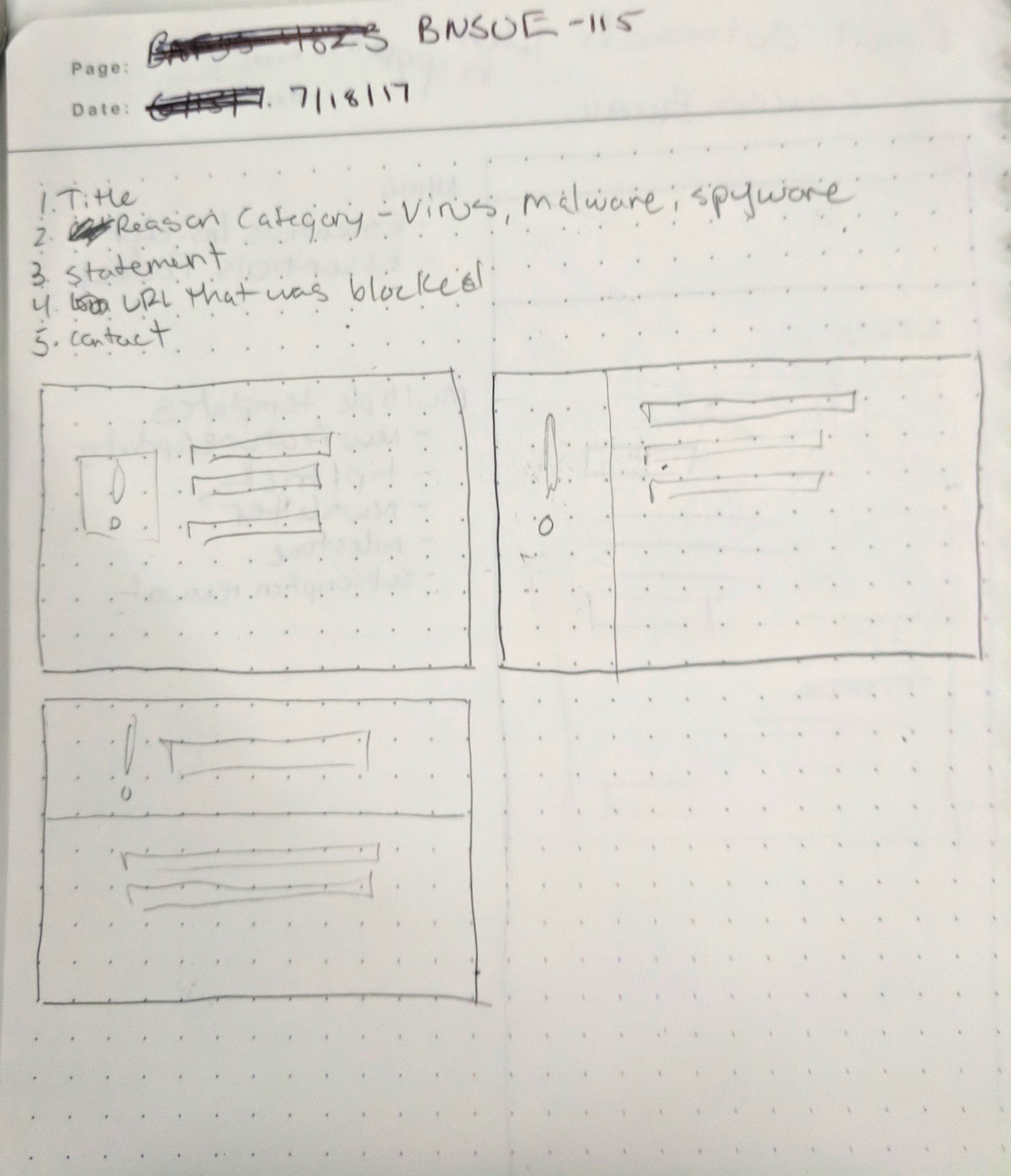
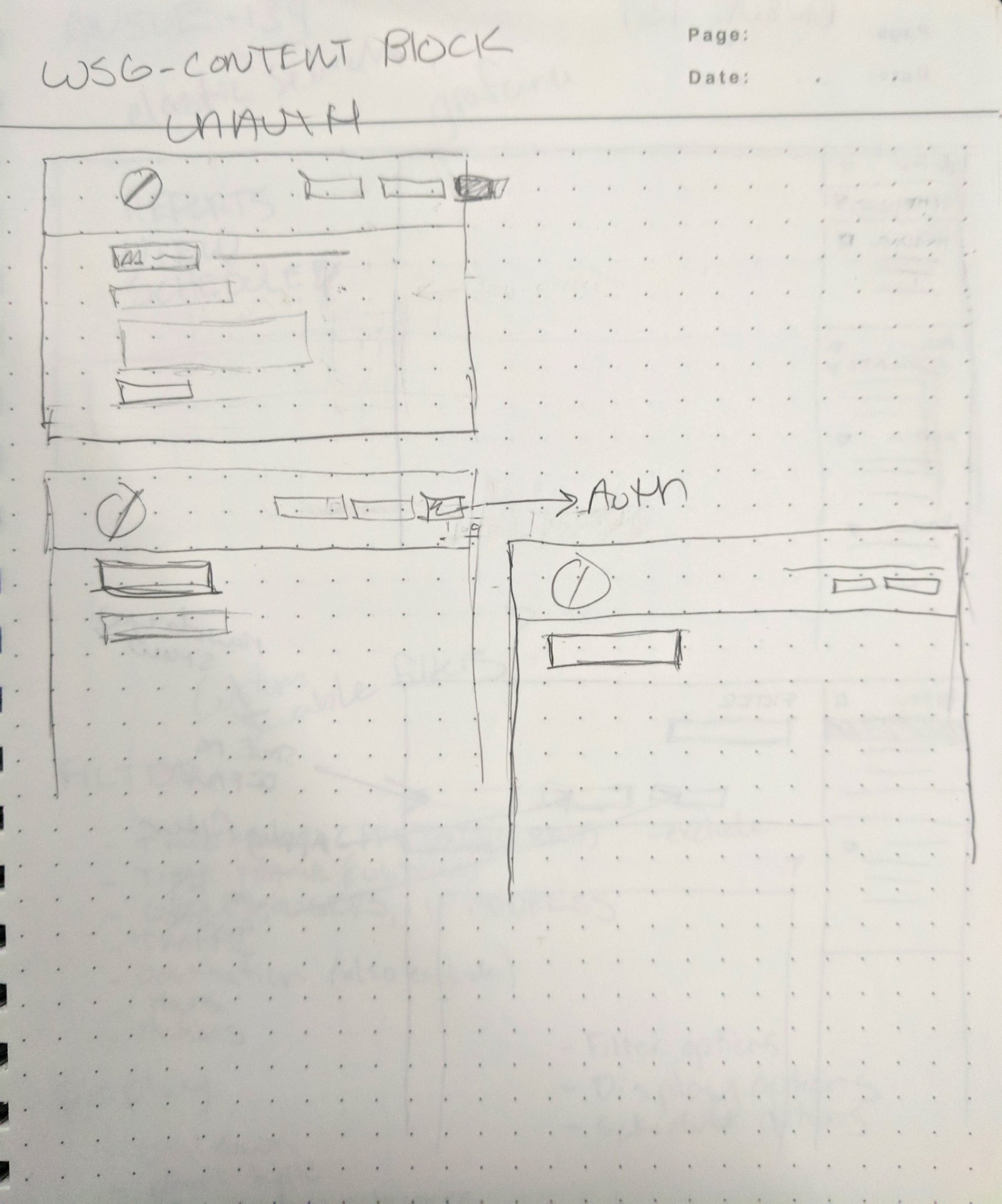
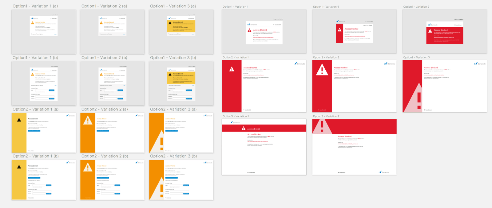
I began mocking up a series of variations in Sketch. I then took these mockups to a stakeholder team of product managers, engineers and sales engineers to narrow down the mockups that they felt would be the most well received by users. They also provided valuable feedback that allowed me to improve upon the designs.
After I narrowed down the options to a pair of designs I then A/B tested with users to see which of the two variations had more a more positive reaction. The testing provided a very clear winner. The designs were then presented to the various product teams whom agree that their original goals were met.
Final Deliverables.
Currently the new block page designs are integrated into three products and growing. This project helped to create a more consistent visual language across multiple products which will in turn help foster user understanding and ease of use.