Improving Employee Experience with an Embedded Chatbot
In 2016, a startup was founded by a team of ITSM professionals to launch a virtual assistant product that aimed to transform the way enterprise employees seek help. However, the initial version of the app failed to consider the fact that enterprise users had to work with multiple tools, which ultimately hindered its adoption.
Role
Lead Product Designer
Functions
Research, Interaction, Visual Design, Prototyping, Testing
Time
3 weeks
Multi-Device VS Omnichannel Strategy
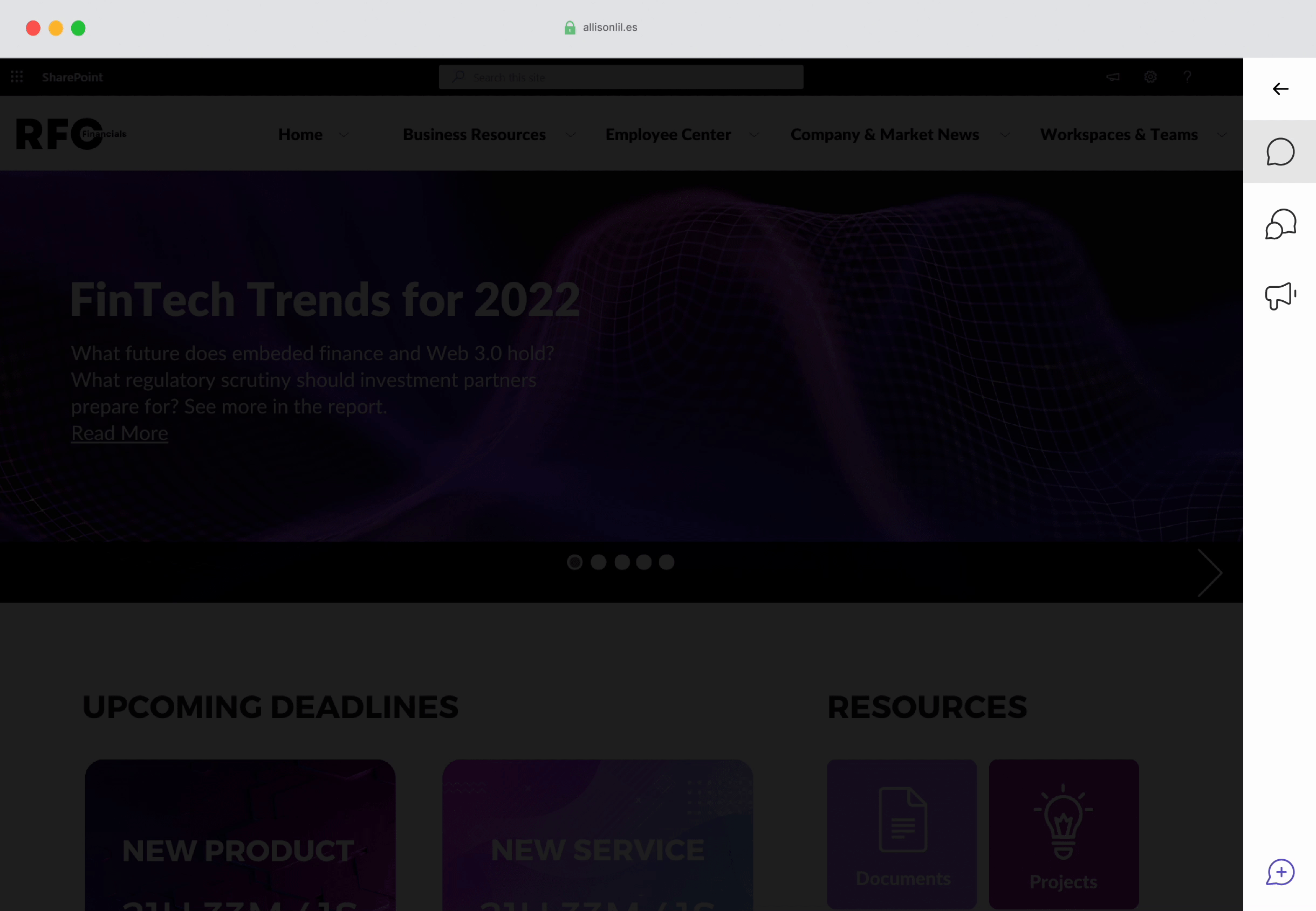
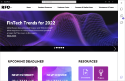
The chatbot was initially developed as a separate app that could be accessed on various devices through a responsive web application. However, it was later discovered that customers preferred integration with their existing workspaces.
Original
The original chatbot was designed as a responsive web application on the following platforms.
- Web application
- iPad
- Mobile (iOS & Android)
Solution
After talking to customers, I suggested integrating the chatbot into their existing apps.
- Embedded solution
- Integrations (Teams, Slack, GChat, Webex, etc..)
- Browser plug-in
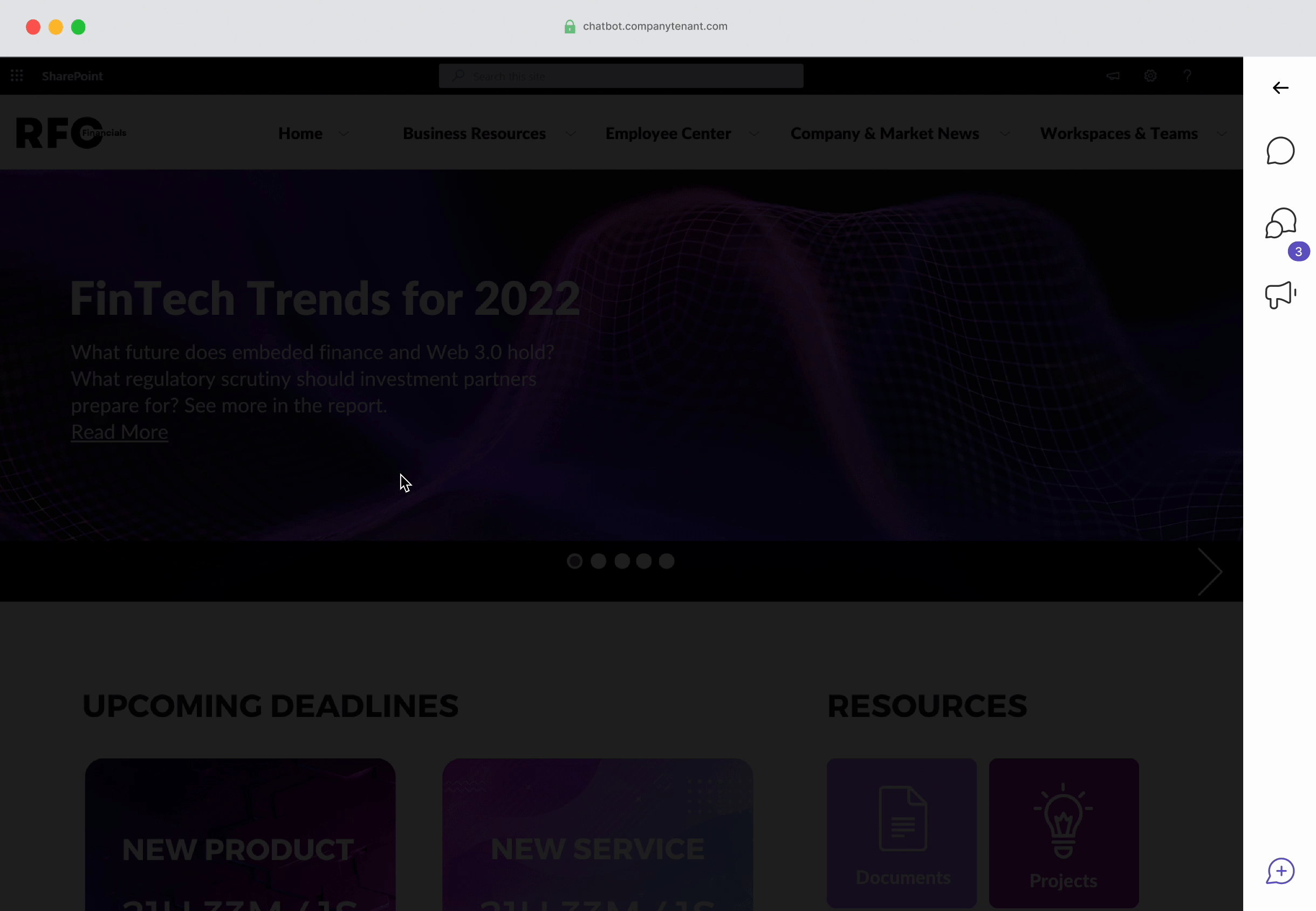
This case study will be highlighting the embedded widget part of the strategy.
Understanding the Problem
The customer success and product team informed me that some customers had complained about their users not utilizing the chatbot as expected. They were seeking a more flexible deployment solution that would enable them to expose their users to the chatbot without redirecting them to a separate web application.
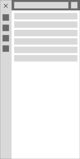
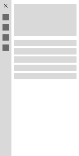
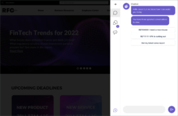
Testing an Embedded Widget
We developed a minimal version of the chatbot as an embedded widget to solve the immediate accessibility problem and beta-test the solution with customers.
Reviewing Feedback
The customer administrators were pleased with the embedded widget and reported an increase in user interactions since they started using it. However, there are some feature gaps and usability issues that have arisen due to the widget being deployed as an experimental interface.
The majority of the feedback about the embedded widget revolved around lack of functionality and features that were missing from the original web application.
Brainstorming
After receiving feedback from beta testing, it became apparent that we needed to merge the essential features from the web application into the widget solution. This was necessary to provide all the functionality that customers required for their users. Before starting my design ideation, I scheduled a meeting with customers and stakeholders to discuss past usability issues with the web application. My goal was to ensure that those issues were addressed in the new design.
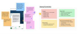
It was quite evident that there were some frequently occurring themes:
Issue
Description
Users do not know how to start a conversation.
In the web application, users had to click on a navigation item to start a conversation. This would bring up a modal containing a conversational UI. However, there was a significant issue with discoverability. Most users would not click the item but instead type their question into the large search bar at the top of the application, primarily used for the home feed.
The home feed is confusing for users.
Users could not understand the purpose of the home feed. They could not find the conversations and items that they were looking for. They also could not understand how to manage the items in the home feed, so only relevant items were shown.
Multiple irrelevant navigation items provide the users non relevant paths
Some customers did not require certain features provided in the navigation, causing confusion among users.
Narrowing Scope
It became clear that previous product decisions needed to meet the needs of our customers. To improve their experience, I decided to rethink how users interacted with our chatbot. However, due to limited resources, I had to prioritize and focus on a set of essential user stories for the first phase. I proposed this approach to ensure we could deliver the most important features to our users with our available resources.
- As a user, I want to be notified of changes with my tickets, so that I know what is going on.
- As a user, I want to be able to find my active tickets, so I can check the status.
- As a user, I want to be able to leave comments on my tickets, so that I can let the agent know any updates.
- As a user, I want to be informed of any announcements quickly, so that I can be informed.
Ideation
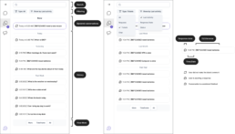
Navigation Options/Structure

I experimented with different ways to allow users to complete tasks and find items. I utilized common navigation patterns. All had their pros and cons.
- Dropdown/hamburger menu – This had the advantage of keeping the conversational user interface minimal and had a downside of reduced discoverability.
- Sidebar with icons – Icons alone are not good for usability/accessibility, but this could be solved. Also provided the ability to add badging on items where there were items the user needed to address.
- No navigation – Users would find items only through the conversational UI. They would converse with the chatbot directly to find the items they sought. This was not technologically feasible with the current implementation of the product.
Moving Forward with Option 2
I decided to move forward with the second option as I believed I could overcome the usability issues, and it was the most technologically feasible for the team to deliver. (I did not completely give up on the idea of #3 though.)
Placement
Customers could configure the widget to be positioned either on the right or left-hand side of their websites. The chatbot UI would span the whole vertical width of the browser window to allow for more room navigation items in the future.

Notifications
Customers could configure the widget to be positioned either on the right or left-hand side of their websites. The chatbot UI would span the whole vertical width of the browser window to allow for more room navigation items in the future.
Navigation Areas
Each navigation area should cater to the specific needs of its respective features. To ensure a seamless user experience, I designed a consistent layout that enables users to locate the desired functionality easily.
Conversations (Including tickets)
Announcements
Solution
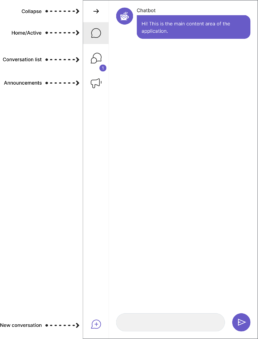
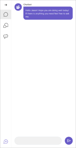
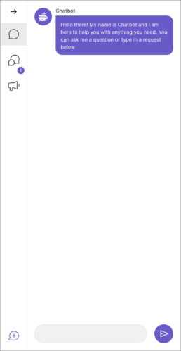
Conversational UI
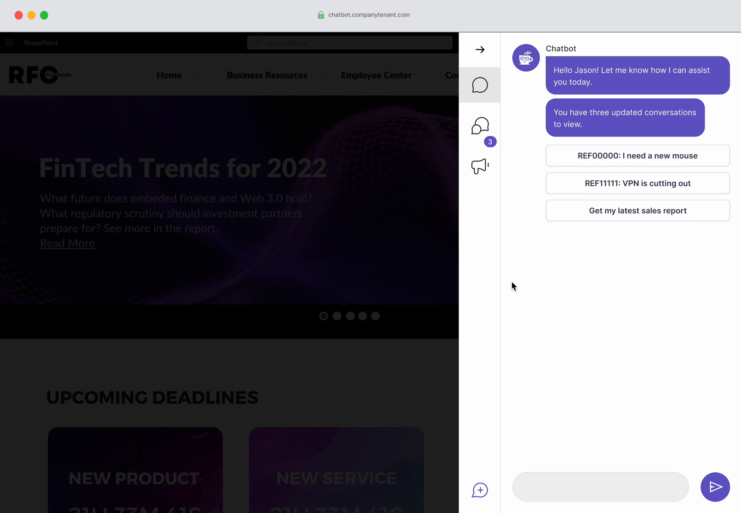
One of the most important tasks for the user was to have the ability to initiate a conversation with the chatbot easily and quickly. However, the original web application had hidden this functionality, which resulted in confusion. On the other hand, the experimental widget had brought the conversation to the forefront of the experience and proved to be much more successful. Therefore, I suggest continuing with this successful pattern.
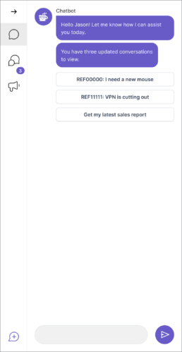
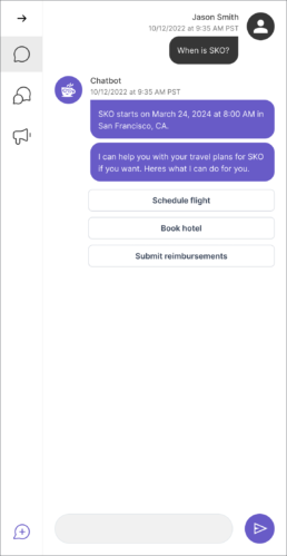
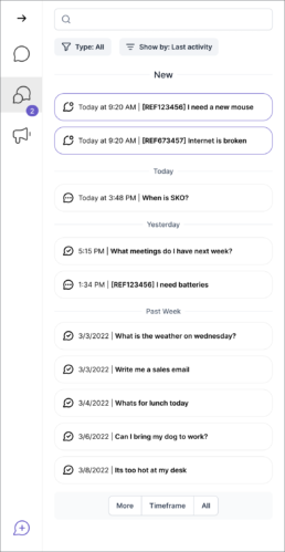
Viewing past conversations and tickets/requests
We combined tickets and conversations into a single navigation item to address the difficulty in differentiating between them. The conversation section’s home screen now has user-friendly features such as search and filtering options. We focused on making finding and accessing the most relevant conversations easier for users.
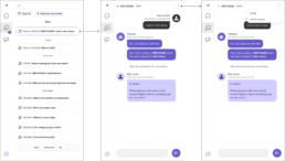
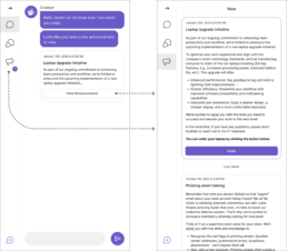
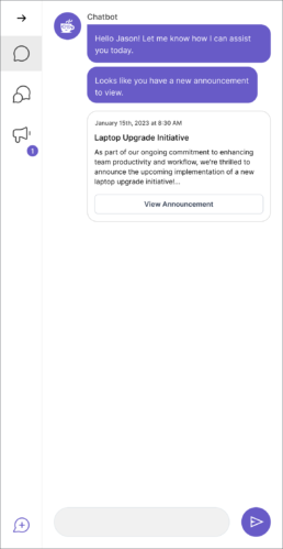
Announcements
Announcement is an existing feature that allows customer admins to send mass communications through the chatbot interface.
Validation & User Testing
I performed some basic usability testing combined with some qualitative interviews to validate design decisions.
Mixed (Usability + Interviews)
12
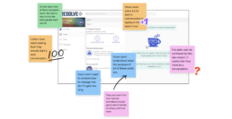
Sample Results
01. If you wanted to view past conversations, what would you do?
| Click on the second icon | 98% |
| I don't know | 2% |
02. How would you ask a question?
| I would type in the box at the bottom | 95% |
| I would click on the + button at the bottom | 5% |
Why?
- “Thats just how these types of apps work.”
- “Because thats how I use messages on my phone and it looks similar.”
- “Is there another way? Other than typing in the box?”
- “The plus at the bottom probably creates a new conversation. So it must be there for a reason.”
01. Can you tell me how many new updates you have?
| Two | 99% |
| I don't know | 1% |
Why?
- “I said that because theres a purple bubble that says two.”
- “The purple bubble and there are two items in the new section.”
- “I think it’s two because of the bubble.”
- “There’s two items with a dark border at the top and the bubble.”
02. Which of these conversations are you waiting for a response on?
| I need new batteries | 74% |
| I don't know. | 18% |
| When is SKO? | 8% |
Why?
- “I think the three dots means I am waiting for someone to respond.”
- “If anything new is up at the top then everything below must mean it doesn’t have an update so I must be waiting for someone.”
- “I can’t tell from this.”
01. What would you do if you saw this screen?
| Click on the button in the chat | 87% |
| Click on the navigation item with the counter bubble | 12% |
| I don't know | 1% |
02. What do you think this screen is showing you?
| I have a new announcement about a laptop | 89% |
| There is something new I need to look at | 11% |
03. What would you do if you saw this?
| Click on the button in the chat | 98% |
| Click on the navigation item with the number | 2% |
Why?
- “I like this because I can see the new things right away.”
- “Being able to get a new laptop is pretty important to me so I like that it’s the first thing I see.”
- “It might be nice to see the whole announcement without clicking on the button.”
Final Designs
As a user, I want to be notified of changes with my tickets, so that I know what is going on.
As a user, I want to be able to find my active tickets, so I can check the status.
As a user, I want to be able to leave comments on my tickets, so that I can let the agent know any updates.
As a user, I want to be informed of any announcements quickly, so that I can be informed.

Reception
Positive
- Customer admins were thrilled that more of the necessary functionality had been integrated into the widget.
- Customers wanted to know if they new application could be used on a mobile device.
- Customer admins said they were looking forward to more functionality.
Negative
- Users were a bit confused about how to start a new conversation (more so than in initial testing.)
- Placement of notification badge caused some confusion (users not knowing what navigation item it corresponds to.)
- Users reported filtering still felt cumbersome and they did not want to use it.
What I Learned
- Context Switching/starting a new conversation – Users are confused about how to start a new conversation. I designed the solution to fit the existing architecture, but some complex changes are needed to solve this. In the meantime, I’ll add visual prompts to encourage them to guide them thoughtfully.
- Filtering – Users found it tedious to filter conversation lists to find specific items. I want to experiment with simpler, more guided ways to help them sort through this list.
- Iconography – Once we add more functionality the confusion around iconographic meaning will increase. In the first release, there was not much confusion from users about which navigation item was which because there were so few. I want to make sure we are thoughtful and limit how much we grow the navigation bar to reduce this confusion.