Evolving a Conversational UI to Meet the Demands of Modern Businesses
In 2016, tech professionals from ServiceNow founded a virtual assistant product, envisioning a new way for enterprise employees to get help. However, the original app, designed to secure funding and build a customer base, didn’t meet the full needs of the business or customers, leading to unused features, a lack of key conversational UI patterns, and difficult-to-configure processes. Instead of understanding users’ needs, administrators prioritized their own and prescribed solutions without investigation, worsening the user experience.
Getting back to basics
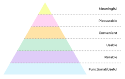
I applied Maslow’s hierarchy of needs to the user experience and attempted to audit the experience based on that. There were many failures and not all of them fell underneath my expertise. I decided I would try and iteratively fix what I could and try and influence the rest – all while listening to the users who were so long overlooked.
Convenience
We deployed the initial version of the chatbot as a standalone web app, but employees found it inconvenient to find and use. We needed to deploy the bot in familiar locations within the organization, so employees could easily access it.
Solution
A flexible chatbot deployment solution that enabled customers to implement the core virtual assistant experience where their users are and integrate it easily into employee ecosystems.
Usability
Over the years feature bloat and poor/rushed decisions added an incredible amount of complexity to the UI. We needed to focus on core functionality and make sure the UI appeared as simple as possible to make the experience consumable to employees.
Solution
Go back to basics. What is the core functionality that employees need to use the most and elevate/prioritize those functions. Reduce noise and conflicting functionality.
Usefulness
This was a primary concern for me with the chatbot. The product was a very focused internal help tool that administrators would configure in very specific ways. End users did not draw any kind of distinction between their organization’s chatbot and those publicly available. Feedback from end users was that the chatbot was useless as it did not “know everything” and it was not “smart.”
Solution
We needed to craft an experience that made end users feel like the chatbot was a valuable tool for their day to day work. Customer administrators wanted to make sure there were guardrails around the content, but also wanted to make sure customers could easily access content, workflows and resources relevant to their organization.
Brainstorming & Ideation
I started by gathering feedback from customer admins and account managers, attending escalation/feedback meetings, and joining customer Slack channels to note usability issues. I observed extensively to guide my preliminary designs and flows.
Testing the benefits of embedded widgets

To eliminate the need to drive users to the standalone web application, we embedded basic chat functionality into a widget that users could add to relevant portals and webpages. This deployment proved popular, and many customers reported increased interactions.
This quick experiment showed that the core chat functionality alone was not enough to meet all user needs:
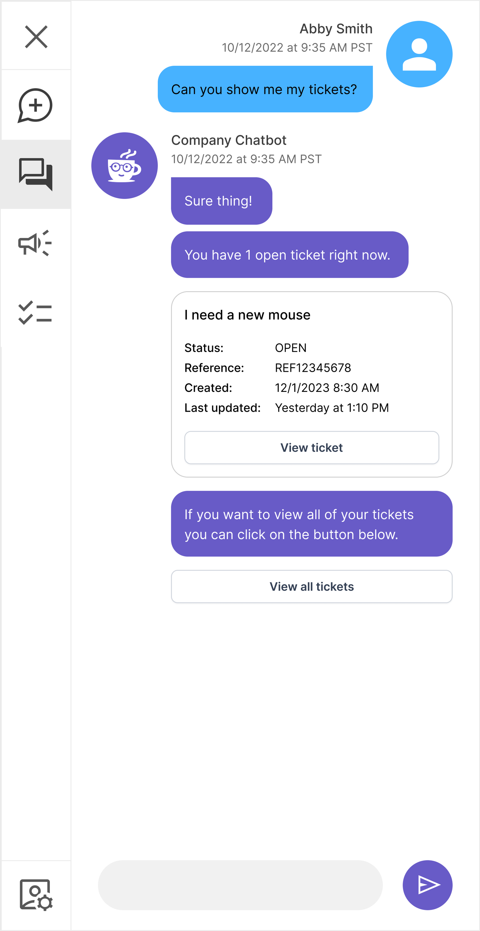
- How do I see all of my conversations?
- How do I see my tickets?
- How do I comment on a ticket?
- How do I get announcements from my organization?
Generating Ideas Quickly
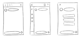
I sketched out a number of ideas on how to solve many of the problems we had been discussing within the context of an embeddable widget.
This eventually led me down a path which was not being mentioned by any stakeholders…
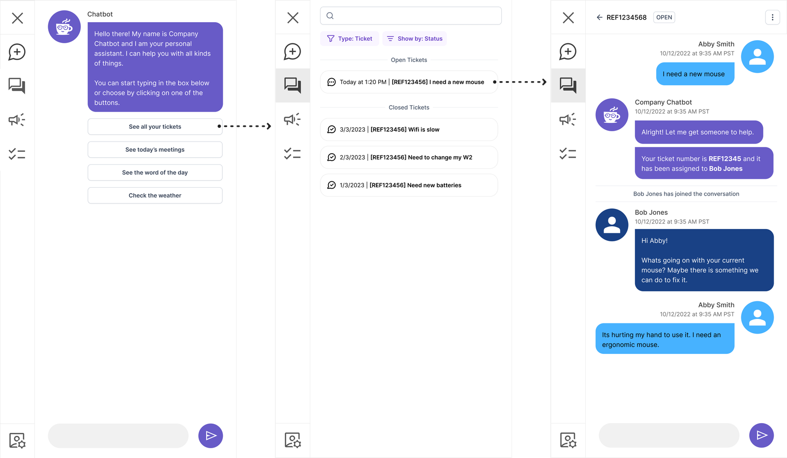
Basic Structure
We needed to establish a basic navigational structure. While I was an advocate for users utilizing the chatbot conversationally there were going to be cases where users may want to traditionally navigate around the application.
Core design considerations:
- Remove all friction both in the UI and conversationally to be able to start new conversations
- Focus on simplicity
- Provide multiple paths for common concerns
- Flexibility for customization
- Turning features on/off
- White labeling/branding
- Have a clear path to mobile adaptability
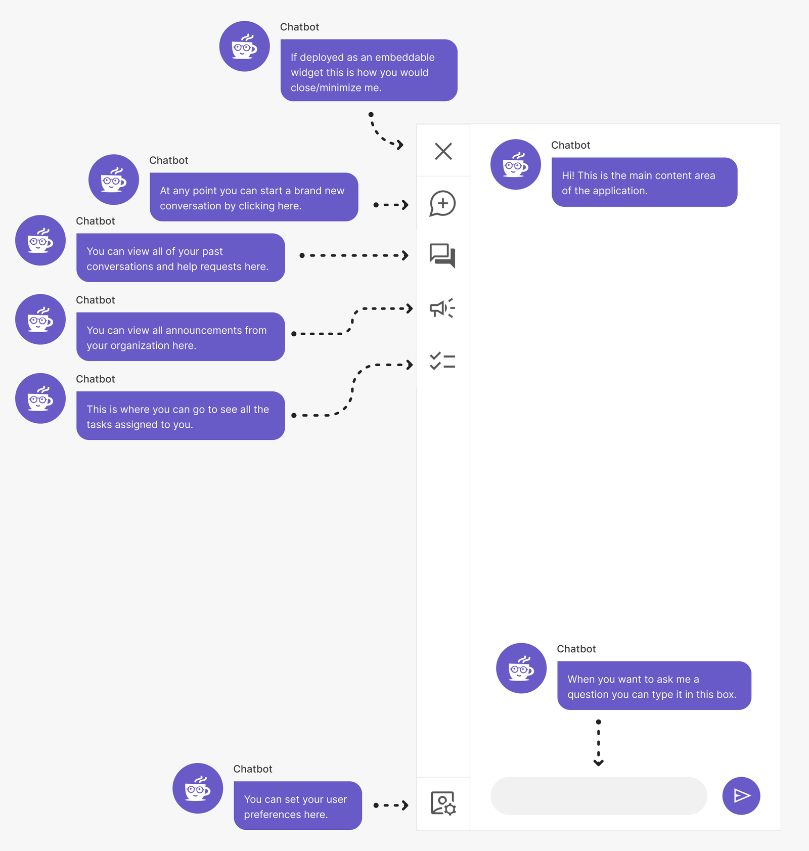
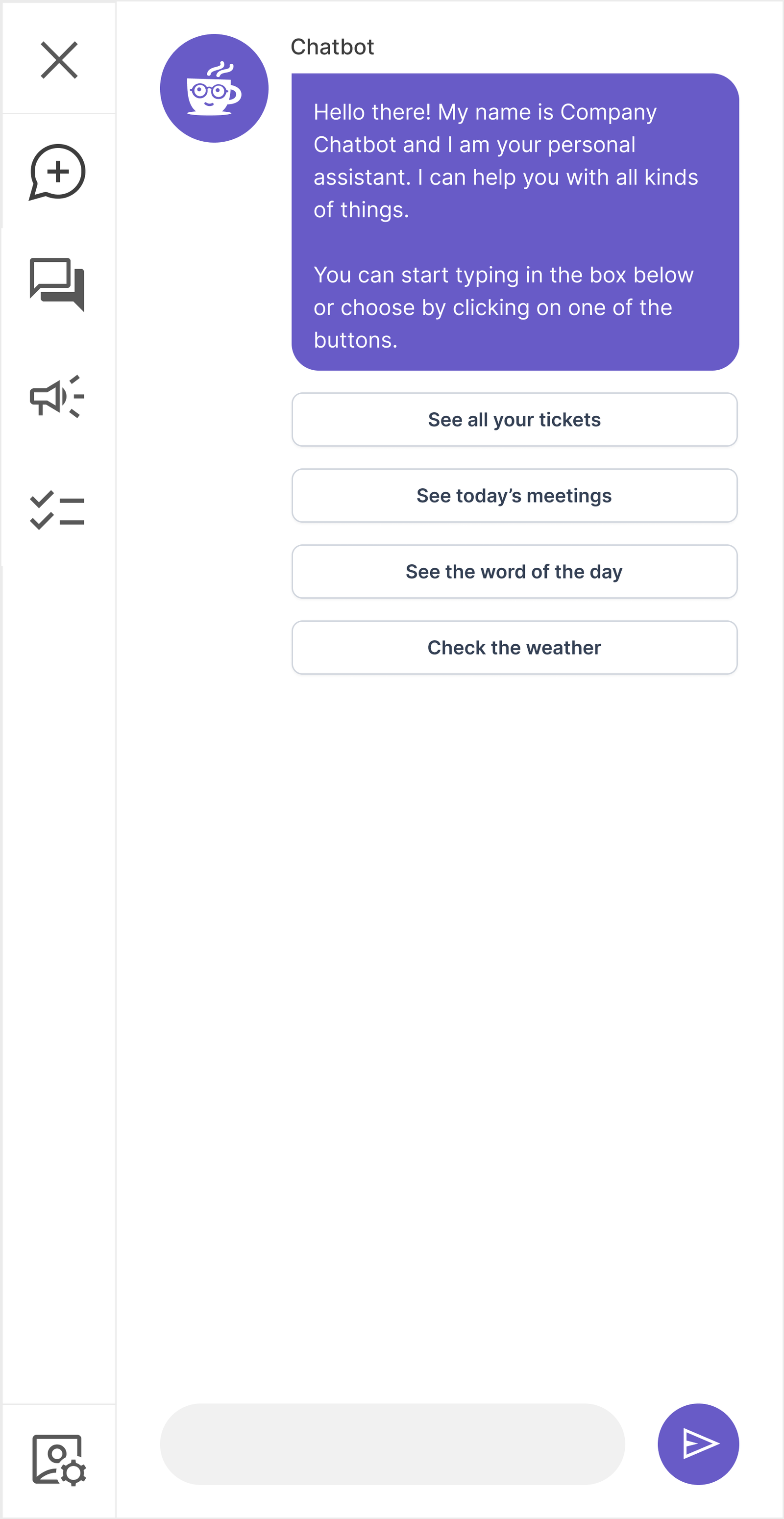
Let the Assistant Guide the Experience
We had the advantage of building a product with patterns and an experience most people were used to. Chat is nothing new to most people.
We could use the initial screen/conversation the user sees as an opportunity to add value and teach them about the more complex patterns within the application.
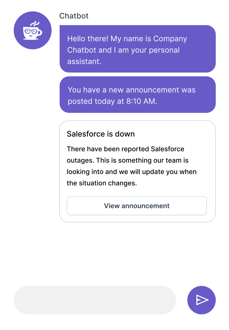
- Notification system to enable users to view and complete tasks
- Platform for customer admins to be able to communicate
- Assistance to the user with numerous day to day tasks
- Area to inject humor, fun and positive experiences for employees
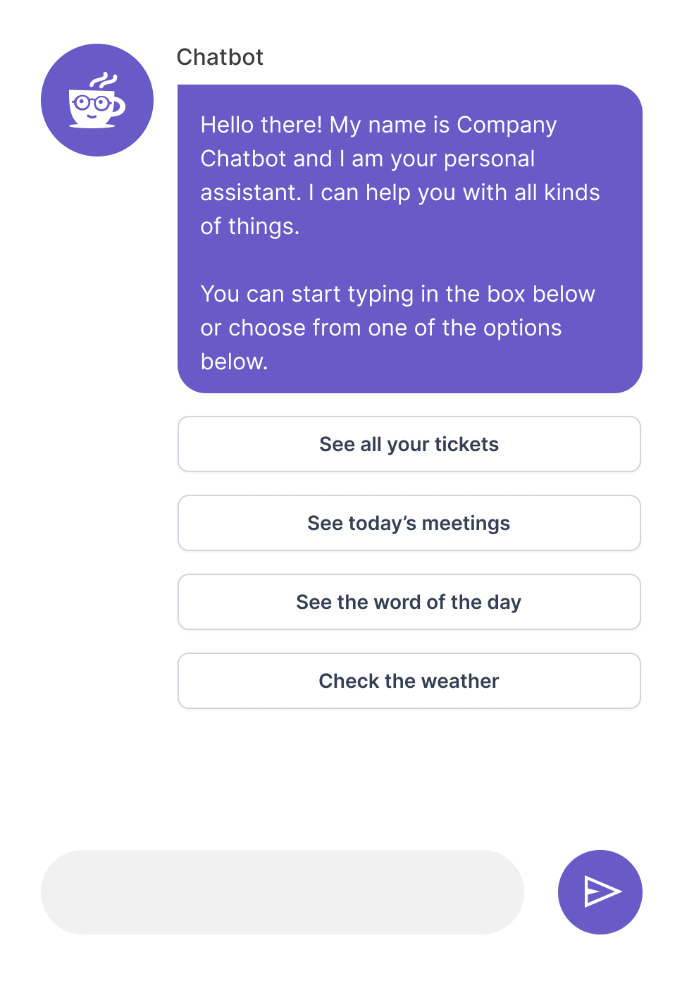
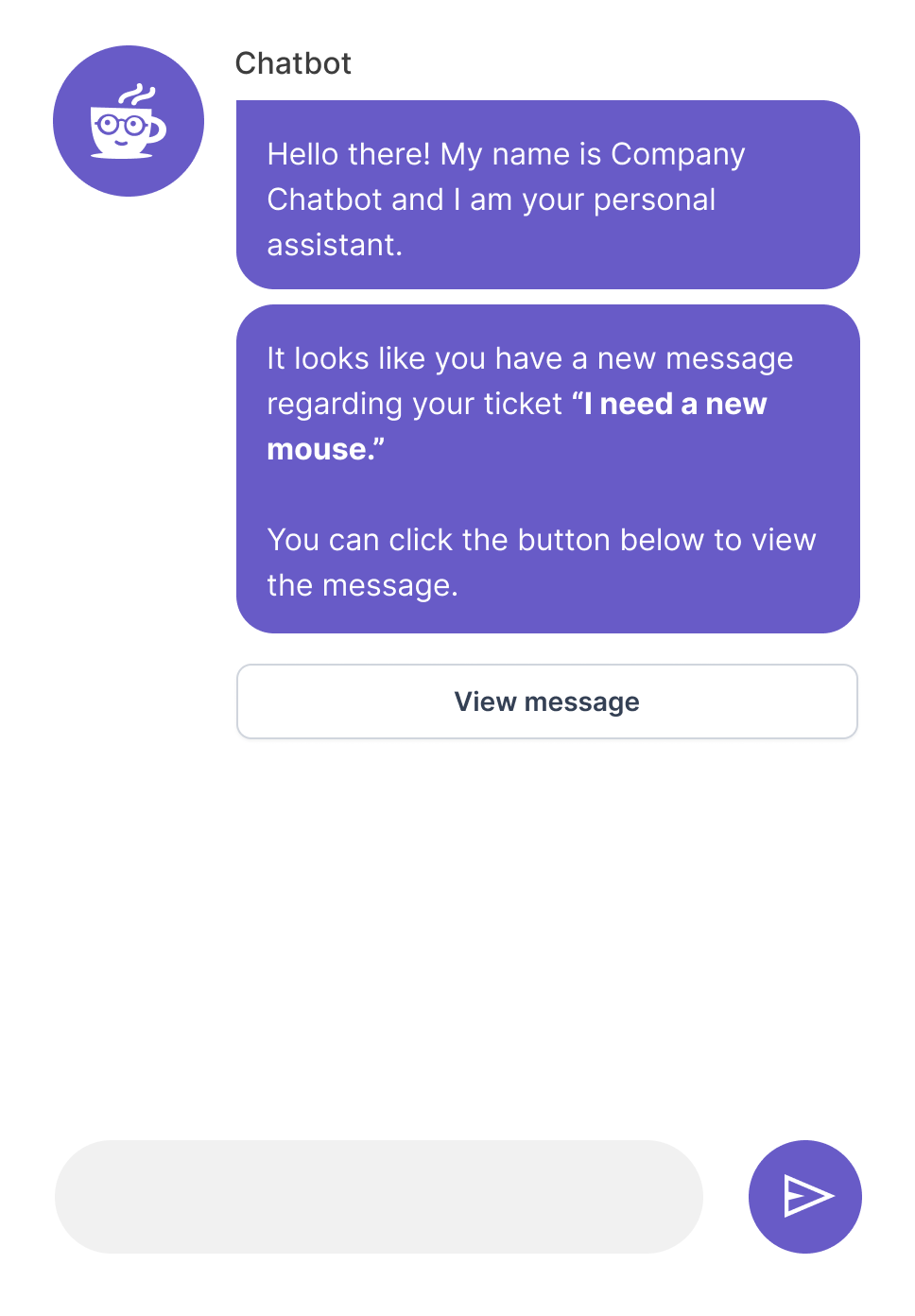
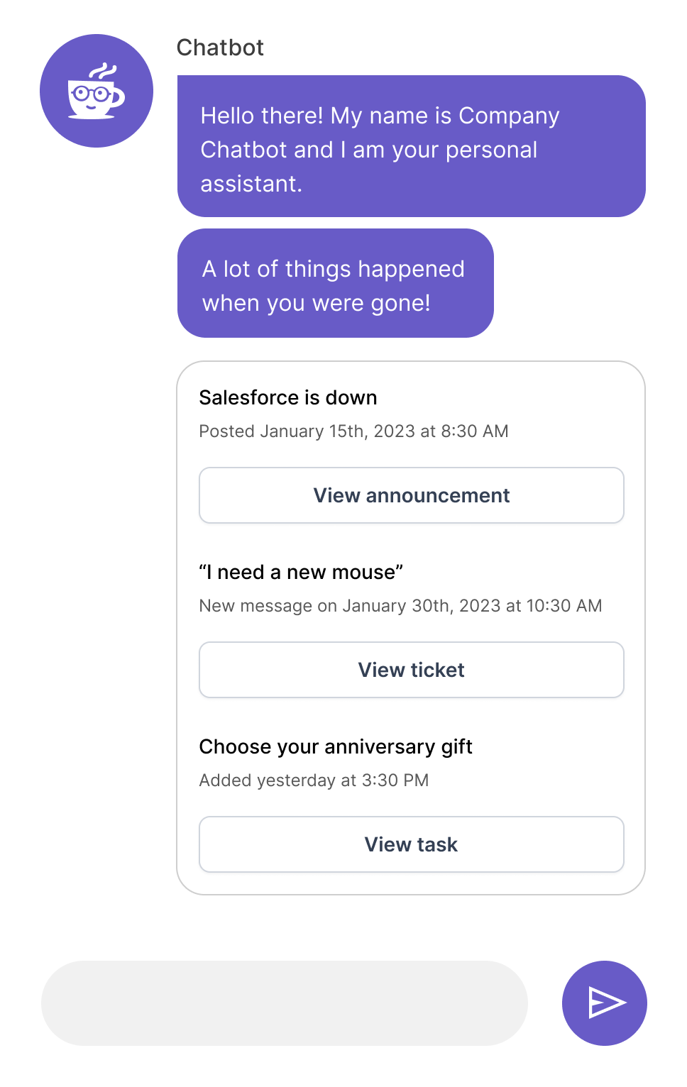
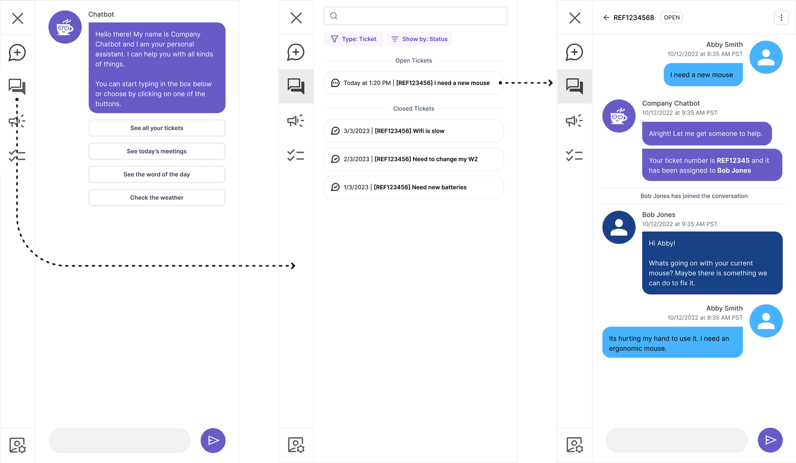
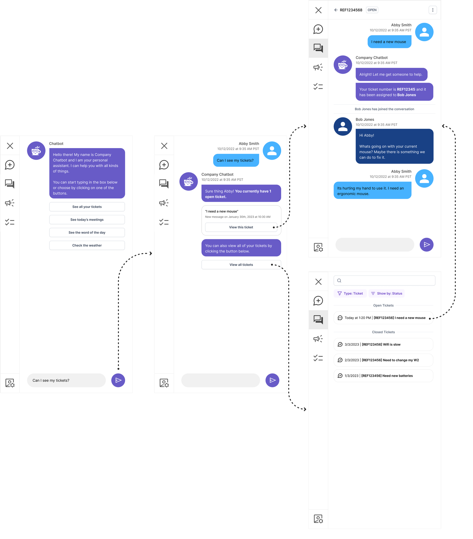
“I want to see all of my tickets”
Provide multiple paths for the user to be able to accomplish most common tasks.
Validation & User Testing
Legacy (Control)
| Action | Users |
|---|---|
| User engages in a conversation with the chatbot | 95% |
| User gives up | 4% |
| User clicks on exit button | 1% |
| Emotion | Users |
|---|---|
| Anger | 48% |
| Disgust | 23% |
| Surprise | 12% |
| Sadness | 10% |
| Anticipation | 7% |
| Fear | 0% |
| Trust | 0% |
| Joy | 0% |
“I don’t think I can do what you’re asking me to do.”
“Thats impossible. It won’t let me.”
“I tried to ask the chatbot, but it didn’t do anything.”
“I wouldn’t use this. I would just go to the help desk website.”
“This thing is stupid. I thought chatbots were suppose to be smarter than this.”
“I would just call the help desk and ask them about my ticket. It’s easier than this.”
Proposed
Group A : Navigation Only
| Action | Users |
|---|---|
| User asks the chatbot | 59% |
| User clicks on icon 1 (conversations) | 24% |
| User clicks on icon 2 (announcements) | 9% |
| User clicks on icon 3 (tasks) | 8% |
Group B : Navigation + Contextual Start + Conversational
| Action | Users |
|---|---|
| User asks the chatbot | 43% |
| User clicks on the button in the conversation | 39% |
| User clicks on icon 1 (conversations) | 15% |
| User clicks on icon 2 (announcements) | 2% |
| User clicks on icon 3 (tasks) | 1% |
Group A : Navigation Only
| Emotion | Users |
|---|---|
| Joy | 61% |
| Surprise | 17% |
| Trust | 7% |
| Anticipation | 6% |
| Disgust | 5% |
| Anger | 4% |
| Sadness | 0% |
| Fear | 0% |
Group B : Navigation + Contextual Start + Conversational
| Emotion | Users |
|---|---|
| Joy | 59% |
| Surprise | 28% |
| Trust | 11% |
| Anticipation | 2% |
| Disgust | 0% |
| Anger | 0% |
| Sadness | 0% |
| Fear | 0% |
“I can actually just ask the chatbot?”
“This is the way it should be. I don’t know why it wasn’t this way before.”
“I can just click on the button! Thats easy!”
“Can it do my taxes for me?”
“This feels so much smarter to me! What else can it do?”
“It’s like a real virtual assistant now instead of a useless thing.”
What We Learned
Key Insights
- When presenting a conversational UI – the majority of users will try and follow that paradigm and will expect tasks to be completed via conversation
- There is a non-inconsequential number of users who will not pay attention or read initial screens
- Iconography is not enough to communicate complex ideas
- Combining items with different contexts confuses users
Design Changes
- Change the navigation from an icon only presentation to a combination of icons + text
- Review and reevaluate iconography to match user’s mental model
- Break up the concept of “conversations” and “tickets”
- Provide conversation guidance around users changing contexts within the same conversation
Moving forward
How do you move a mountain? One shovelful at a time.
Phase 1
Collaborative development process. In my experience large redesign/changes in a product require very regular cadence of check-ins to make sure that any and all questions are answered in a timely manner.
- Facilitates a well built product that follows the design more closely
- Helps developers to empathize with users
- Developers understand design decisions
- Relationship building between dev and design
Phase 2
Beta testing & feedback program with select customers. Changes of this magnitude can be very disruptive from an organizational perspective. We had a very excited group of customers that were willing to release the beta version to their users and engage in a collaborative research effort.
- Regular check-ins with customer
- Analyze usage analytics to see where users are falling off
- Additional user testing as needed to validate additional problems
Phase 3 & Beyond
Continuous design exploration & changes. SaaS products are ever changing and it is important to iterate on both strategy and design.
- Adapting embedded portal design to mobile
- Establishment of predictable conversational UI patterns to foster comfort and familiarity across the org
- Deep five into specific functionality regarding tickets, announcements and tasks
- UX guidance on how to merge ChatGPT and new technologies into the experience